
How did we streamline the check-in process at ophthalmology clinics for the visually impaired?

Timeline:
July - September 2023 (3 months)
Team:
1 Research Coordinator, 1 UX Designer (me), 1 Subject Matter Expert
Tools:
Figma, Zoom
READ CASE STUDY↗
0->1 Design Project. Delivered a development-ready prototype
Accessible Icon Library. Introduced 25+ icons and illustrations to help patients understand ophthalmic, medical, and pharmaceutical terminology using accessible color palette
UX Research. Tested the Oculus Kiosk proof-of-concept with visually-impaired individuals; results provided content for research paper
Research Paper. Co-authored a research paper on ontology-based kiosks for ophthalmology clinics for conferences
Disclaimer
All of the concept, research, and original drawings created for the Oculus Kiosk is owned by Camille Dorset (MS, Applied Health Informatics at Fordham University). The Oculus Kiosk was a collaboration project between Camille Dorset (owner of the Oculus Kiosk), John Chelsom/Seven Informatics Ltd., and myself (a contract UX Designer).
Seven Informatics Ltd., a research consultancy, recently explored integrating cityEHR into ophthalmology triage. A student researcher, also an SME and former ophthalmology MOA, created proof-of-concept sketches based on clinic care pathways. My task was to refine these sketches into an accessible and UX-driven prototype that would accommodate ophthalmology patients of all backgrounds.


Inspired by an SME’s anecdote of a patient without fingers, the Oculus Kiosk prioritizes larger touch targets for accessibility. Digitizing intake removes the struggle of holding a pencil for physically or cognitively impaired patients. With oversized buttons exceeding WCAG 2.1’s 44x44 px standard, even those with limited dexterity can navigate the interface with ease.


Intuitive Iconography
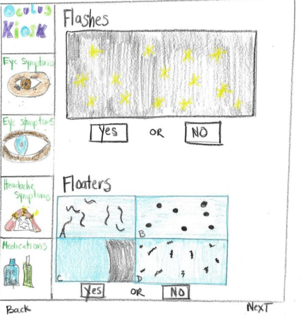
An SME from a New York City ophthalmology clinic stressed the need for clear visuals to simplify complex medical jargon. Since most patients struggle with clinical terms, large images and icons aid recognition, especially for the visually impaired. Condition names were simplified, and visuals were designed for key medical conditions.
Usability testing showed 80% of participants used icons as helpful secondary aids, confirming choices after reading text. Icons were placed on a dark yellow (#FFB81C) background for contrast, avoiding red-green combinations to accommodate patients with deuteranopia.

High Contrast UI
To enhance accessibility, I tested the Oculus Kiosk’s color palette with a color-blind peer and incorporated their feedback. I also referenced WCAG 2.1 contrast guidelines to ensure high-contrast colors that accommodate all users, including those with visual impairments like color blindness.


Readability
Sans-Serif. I used two sans-serif fonts—Cal Sans for titles and buttons, and Manrope for labels and body text—to enhance readability by eliminating extra strokes.
Text Size. Larger, bolded text with wider line spacing improves glanceability and lexical decision-making (NNG). Following APH ConnectCenter guidelines, text is at least 18pt (24px) for low-vision users.
Sentence Case. Using sentence case improves legibility by creating distinct word shapes, aiding those with visual impairments. Unlike title case, which appears block-like, sentence case enhances readability—an approach supported by Google's Material Design.

Ergonomic Hardware Experience
40% of participants preferred scanning their health insurance card over manual entry, improving accessibility for physically impaired patients. This feature requires integrating a card scanner into the kiosk or tablet, along with an intuitive onboarding experience to guide users through the process.

The instructional graphics should be self-explanatory and provide users with system feedback and progress of their card scan. There are 3 distinct phases with 1 edge case for errors:
Enter your card
Scanning your card
Remove your card
Card error

A11y Patterns
Implementing an accessible color palette, iconography, and target size guidelines created a more inclusive product and taught the team essential accessible design practices.
25+ New Icons
This project created an accessible icon set to simplify ophthalmology, medical, and pharmaceutical terms, validated through testing with visually-impaired users.
1 Research Paper
This design paved the way for the main subject matter for a research paper. The product is currently in development and the paper is currently in the publication process.


2025
William Lee